
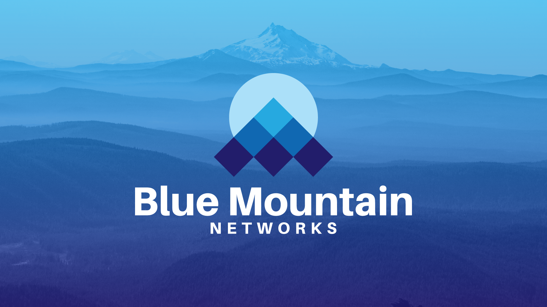
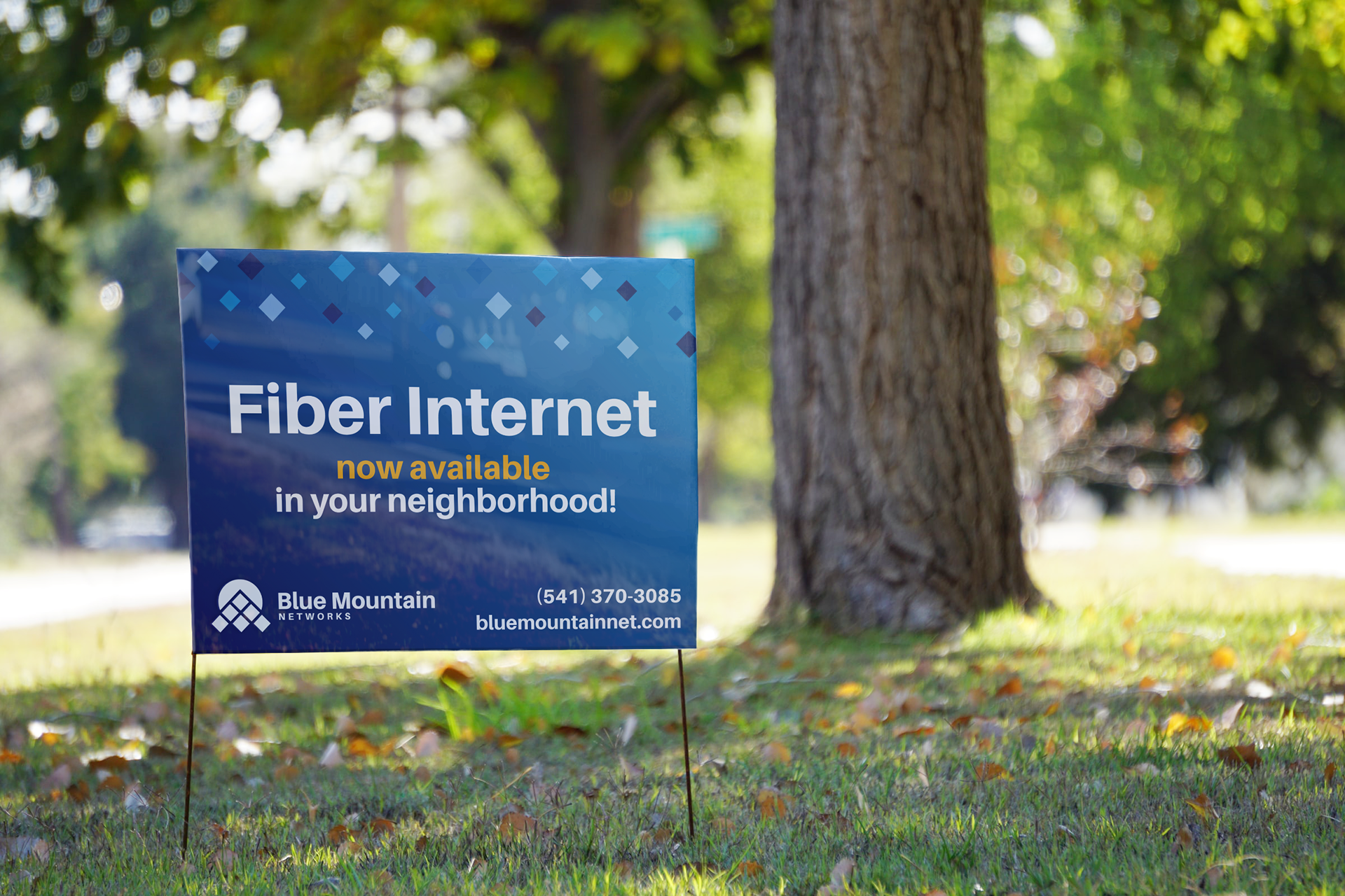
Blue Mountain Networks is an internet service provider located in eastern Oregon and southern Washington. The result of a merger between three regional telecommunications providers, they were in need of a brand that reintroduced them to their customers, replacing the dated logos of the three former companies with one singular vision of the future.
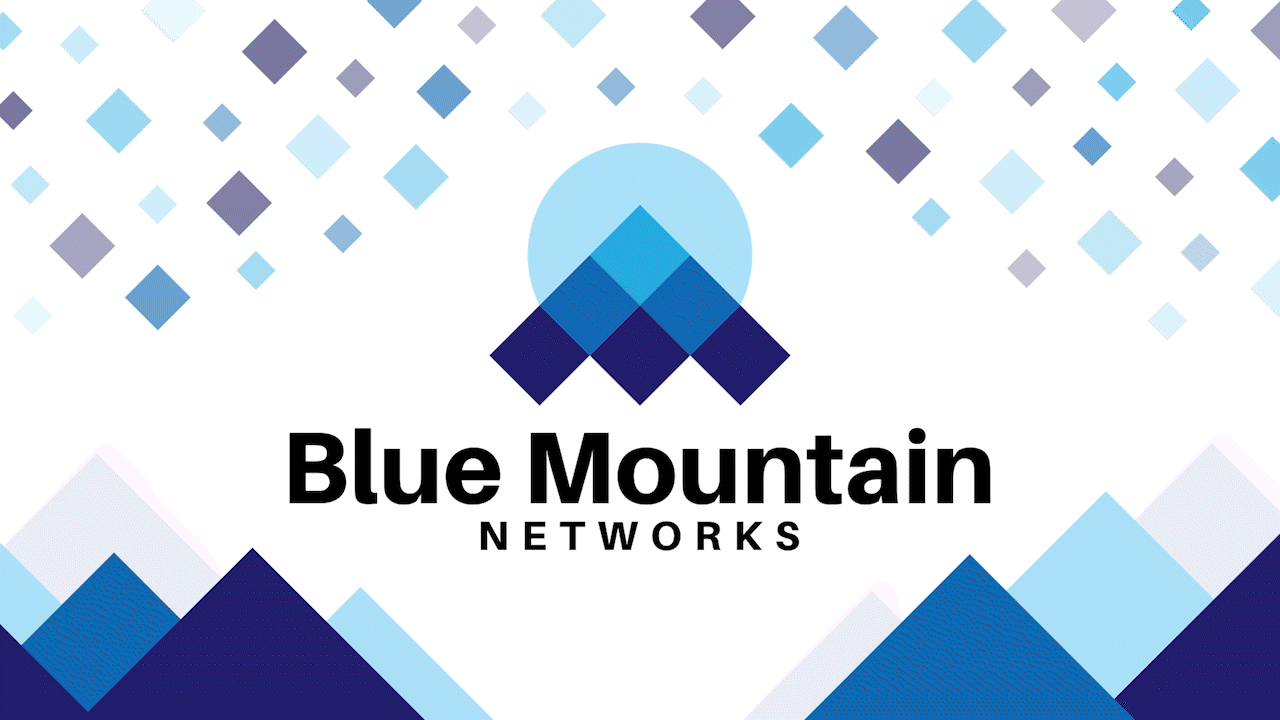
We worked together to develop a visual identity that connected with their roots in the region, while pulling them into the modern age. The three-pointed mountain icon connected to the three original companies, weaving past into future. We found a myriad of ways to use the diamond that makes up base component of the logo. They showed up as mountains, text boxes, and what we came to refer to as the 'sparkle' - stars in the sky, or snow falling on the mountains, or just a bit of extra razzle dazzle. The bezier curves connected to the telecommunications history of the company, evoking over-the-air transmissions, as well as the new age of fiber internet.


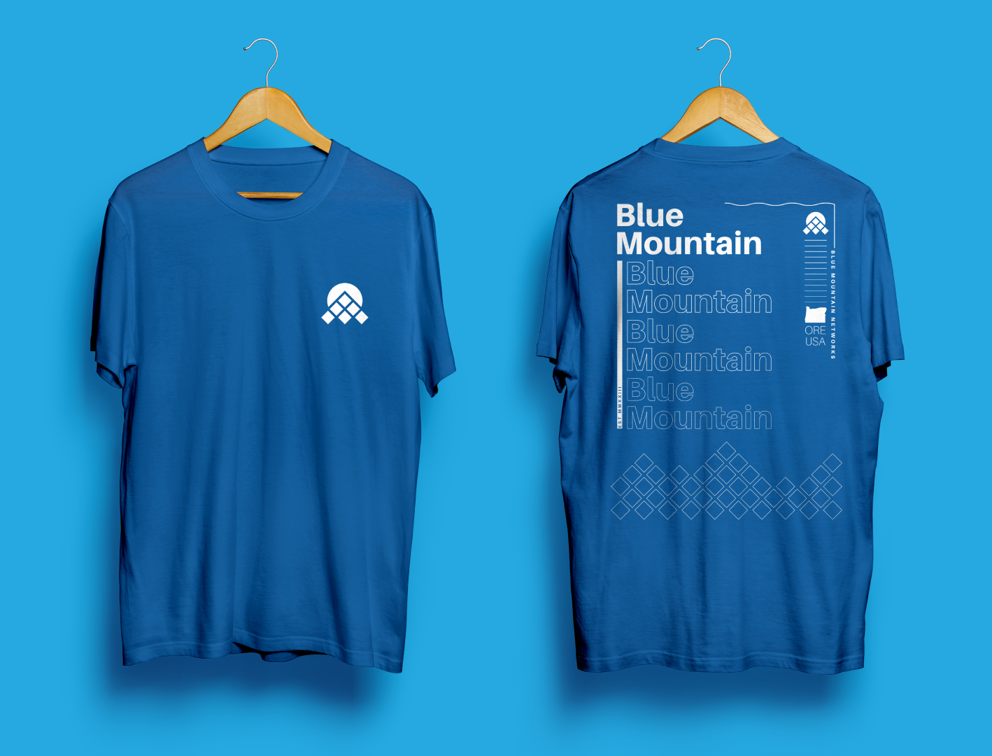


After the initial rollout, we began to push further into the rural identity without compromising the modern look the client wanted. The script type emerged as a way to dress down without compromising the overall look and feel, while also pulling away from the crowded visual language of the industry. The stripes used initially on the vehicle wraps returned as well, letting us add color without complexity.